
In the last post #nowerarescheming I discussed a simple, yet effective way of starting a scheme for a room full of colour and pattern. If colour and pattern were animal based products, last week’s post was a full on Atkins-Diet recipe book.
However there are people out there that only want a little bit of fish in their diet to spice things up. If you are one of these people, that likes the idea of colour and pattern, but it’s the colour AND pattern bit that is giving you the fear, this one is for you.
Consider this the pescetarian’s guide to introducing colour.
If you, or your other half, are one of these people that breaks out into hives at the thought of painting a room a colour that isn’t off-white, these are a few ways that you can introduce a small amount of colour, with maximum impact but with minimal effect on your well-being.
These will give guests and visitors the impression that you are better than taupe, and allow you to slip under the “God their house was dull” radar. Kind of like smoking with the cool kids, but without actually inhaling. All the street cred, but none of the nicotine dependency.
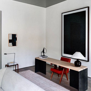
1- Art.
I mentioned briefly in the last blog post, that art is one of the ways to get the ball rolling on what colours to pick in a room. Choose a couple of colours out of the piece of art, and Bob’s your uncle.
Personally I don’t like to do this.
As I said in that post, starting a scheme with art doesn’t answer the question of pattern, but more importantly, unless done with extreme restraint, scheming around a piece of art can start to make your space feel a little like a themed motel room where the art has all been commissioned to drive home the point. So unless you are Sophie Ashby, avoid this method.
The way that I see art, is that it needn't match anything else in the room. The point of art is to be different, to stand out and to speak for itself. Match everything to the art, and it all becomes a little bland and chicken and egg. Which came first, the art or the room?
Let’s be honest, if you are on a budget, it’s the room that came first, and then the art was chosen to match that.
With this in mind, if you want to add some colour, art is easiest the way to do it that doesn’t involve painting a wall. Go wild. Your art doesn’t need to match at all. Especially if you have a neutral scheme to start with.
2- Cutting rug.
Don't underestimate the value of a bold coloured rug. (Note I said rug, not carpet.) A rug is an essential part of any design, and if you apply the same principles to rugs that you do to art, the world is your oyster.There are very few rules when it comes to which rugs go in which style room. Hence their similarity with art.
Go bold, go big, and be colourful. And use the excuse, "most of it will be covered up anyways" if you're the one pushing for colour but your better half is nagging for taupe.
3- Tile and error.
Forget feature walls, it's all about feature floors at the moment. I don't think the idea of coloured floor tiles has ever gone out of fashion, but if you have only been relegated a small space to throw in some colour, a coloured floor tile is a good way to inject a bit of, dare I say, personality into a bathroom. A coloured pattern floor tile is a fun way to differentiate a family or kid's bathroom without having to be too gimmicky with the rest of the items in the room. It will also allow you to keep all the bathroom fixtures and fittings the same throughout the house, so there is still a sense of continuity in that.


4- The downstairs f**kin loo.
Sticking with a bathroom...the most important bathroom of all, the downstairs loo. Not to repeat myself, as I've already done a blog dedicated to this, but if you are trying to fly under the "God their house was dull" radar and you don't let yourself loose with colour in the guest loo, you're asking for it.
This is the perfect spot to inject colour, maintain street cred, but still go about your monochrome existence, unaffected, in the rest of the house.
5- Shut the front door.
It seems that everyone on board with painting their front door a punchy colour. It’s a rite of passage almost when buying your first home. However it’s time to take this concept indoors.
If painting your walls anything other than SLATE (see previous blog) just isn’t going to fly, and you are well aware that adding a feature wall is a crime against humanity, painting your internal doors a colour is the answer. It is a perfect way to introduce a linking colour throughout the house that doesn’t really have any impact on the rest of your colour scheme.
If you are scared of colour, this probably goes without saying, but just pick one colour and roll that throughout. It doesn’t even need to be anything crazy. My place was designed and decorated with the idea in mind that if I didn’t paint the walls SLATE 3, I will probably scare off any potential buyers. Let’s be honest, the line “we can always repaint” is a fib we all tell ourselves, but never actually do. The solution: Farrow & Ball Studio Green doors.
It’s not exactly one of the colours of the rainbow, but it gives a good punch of colour in every room, but allows the rest of the space to be quite restrained.
6- Living on the edge.
Sticking with doors, this next concept should ideally be carried out in addition to my previous point. A second layer of interest so to speak. I’m not a fan of this term a “pop of colour” but this next one is really the ultimate pop of colour. Also, it’s hella subtle, which give the impression that you’re a sneaky design aficionado rather than a colour novice.
Paint a fun colour on the leading edges of your doors.
What’s a leading edge? Basically, these are the side profiles of a door. The thin bits that get hidden by the door frame when the door is closed. You will really only see this detail when the door is open, but it’s a great way to inject a sliver of colour somewhere.
I’ve mainly used this detail when the doors themselves are painted a dark colour (It adds to the contrast factor) so I wouldn’t I suggest using this as an “OR” option for those not keen to paint a door to start with. This is a great option for kid’s rooms or a guest loo where you want to differentiate one door from the next.
“The guest loo? Oh, it’s the one with the lime edging babe”


7- No man is an island
When it comes to your kitchen, you may regard the idea of painting your units a statement colour as a decision reserved for the brave. I get it. Fashionable colours change like the seasons and you might not want a green kitchen forever, nor do you necessarily want to stare at a green wall of cupboards every day.
A good middle ground? Paint only your island a colour, whilst keeping the rest of the joinery something more subtle. You would be amazed at how little of your island you actually see when you are in the kitchen itself. You tend to look down on your island, rather encounter it at eye level, so you see more of your worktops than you do the actual cabinetry.
If ever there was a piece of joinery worth slapping a colour on, that didn’t over power the rest of a neutral scheme, it would be the island.
It’s up to you to decide what that colour ultimately is, but I would say that going darker or bolder on the island than the rest of the kitchen units is generally a fail-safe.
8- Repeat yourself. Repeat yourself
Repetition is key in any decision you decide to make in your home. Regardless how small. 90% of the time I would say that if a detail or a concept is repeated enough times it reads as a purposeful rather than a mistake.
Don’t get me wrong, you can make a bad call 20 times and the result will definitely be hideous, but when it comes to introducing colour in bite size chunks, repeating just a small amount, multiple times, give the impression that you have what it takes without having to paint all four walls.
Take your kitchen stools for example. If all of these were to be in the same bright colour, lined up in a row, this would read as a considered colour statement. A statement that is a lot easier to digest than a bright red kitchen.
The same principle could be applied to a row of picture frames down a hallway. A repetitive snippet of colour sometimes says more than a scheme full of colour and pattern.


9- Fabric
A lot of what I have mentioned above relates to painted or hard finishes as a way of adding in that perfect pinch of colour, rather than the ideas in the previous blog post, which was all about the fabrics and patterns. Obviously it doesn’t need to be either/or with fabrics. Picking a single bold colour fabric for a room, and keeping all the rest quite plain or neutral, does not equate to a half arsed scheme. You don't need loads of colour to make a splash. You just need to be well considered.
If you are nervous of colour or aren't even sure how to evenly distribute colour around a room, let alone a whole house, picking just one item of furniture per room as your colour show-pony is the best way to go. It does mean that you have to be quite restrained thereafter to make sure you aren't diluting its impact in the room, but sometimes just one big loud pop of colour can give the room all the wow factor you need.
Pieces of furniture like headboards, side tables, or occasional chairs are great examples of opportunities where you can make a single bold colour choice, but build in neutrals around that.


Comments